

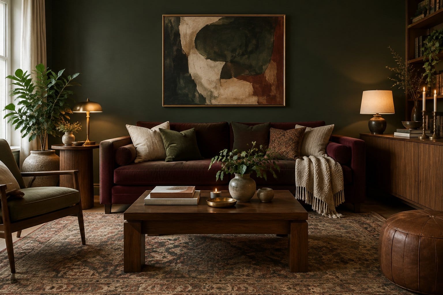
Dark rooms have a way of making you slow down. A deep green living room, a plum dining ceiling, or a lamp glowing against charcoal paint can turn an ordinary space into the spot where everyone ends up after dinner.
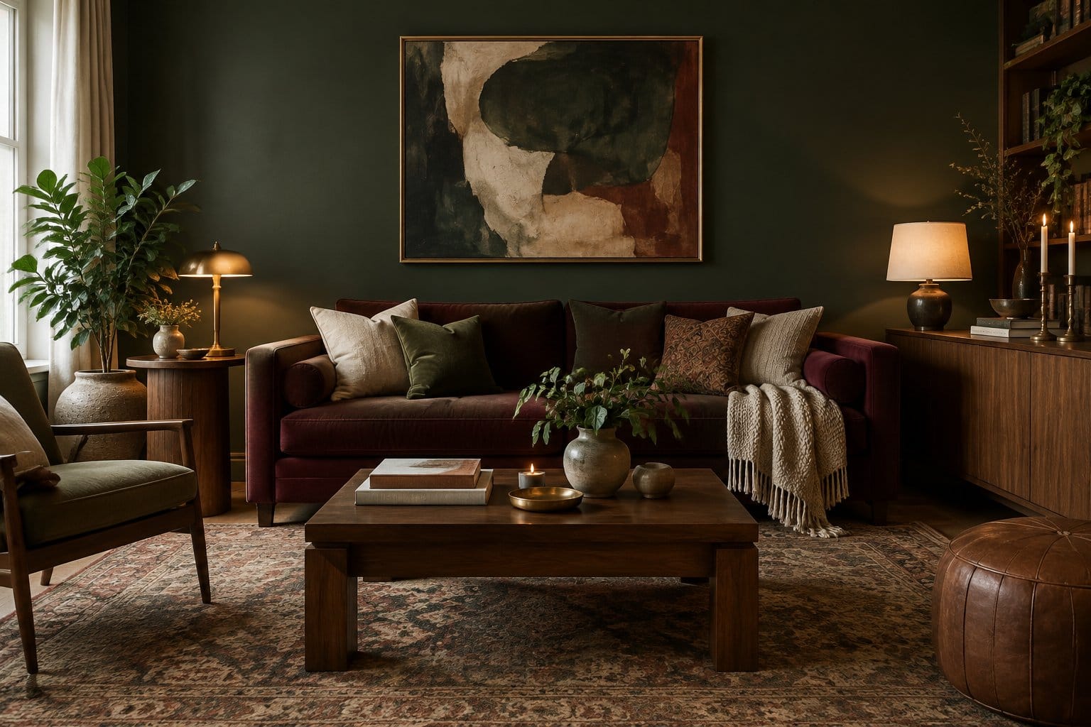
The best way to get a moody room that still feels cozy is to pair one deep, warm-toned color with soft textures and several low, warm lamps, then add dark accents like wood, brass, and art in layers. You don’t have to paint everything black on day one. Some of these ideas cost the price of a light bulb, and others ask you to commit to cabinets or tile for years.
The list below runs from easy swaps to full makeovers, so you can pick the level of drama you’re ready for. If you want more ideas as you plan, browse our home decor picks and start building the room you keep picturing.
1) Color-Drench a Living Room in Forest Green
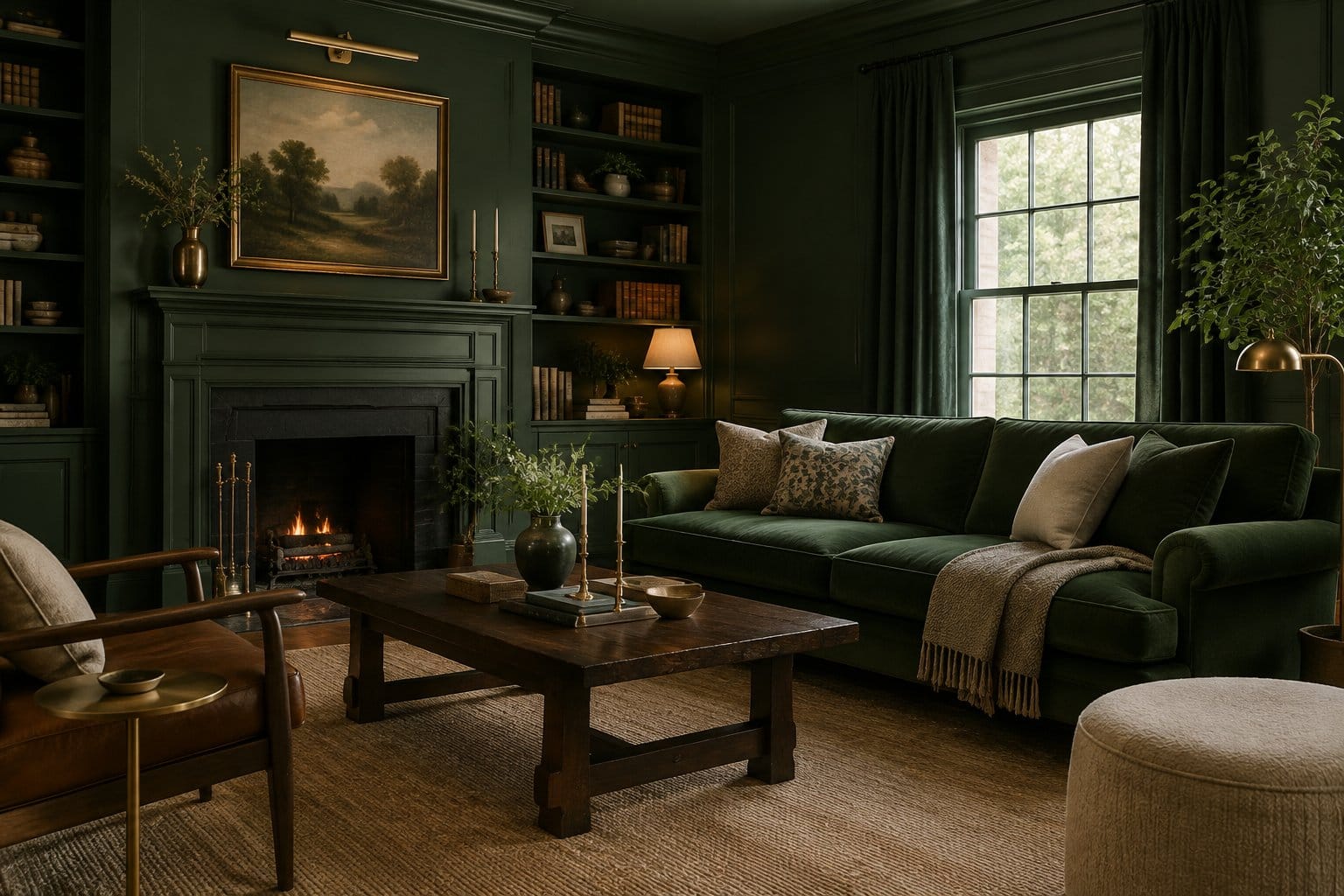
Color-drenching means painting the walls, trim, and sometimes the ceiling in one shade. In forest green, the edges of the room blur, and the space feels wrapped instead of boxed in.
Here’s what makes it work in a real room:
- Pick a green with warm or yellow undertones. Cool, blue-leaning greens can look gray and flat at night.
- Use different sheens. Try matte or eggshell on walls and satin on trim. Same color, slight contrast, and the trim is easier to wipe.
- Add warm wood. Oak, walnut, or a vintage pine coffee table keeps the green from feeling like a cave.
A green sofa takes the drench even further. It sounds like a lot, but tone-on-tone looks calm in person.
The tradeoff is labor. Trim and ceilings take longer to paint than walls, and dark colors often need an extra coat. Plan a full weekend for an average living room, and buy more paint than you think you need.
2) Paint a Matte Charcoal Wall Behind the Sofa
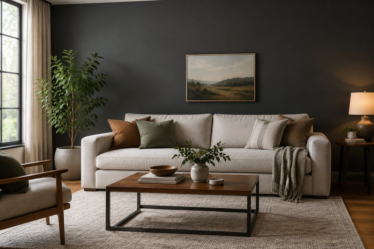
One charcoal wall behind the sofa is the easiest “try it first” move on this list. It gives you drama without touching the whole room, and repainting one wall is a small job if you hate it.
Matte finish is the secret here. It soaks up light instead of bouncing it, so the wall looks soft and velvety, almost like felt. Glossy charcoal shows every dent in drywall.
Tips for getting it right:
- Choose a charcoal with a slight warm or brown base if your room faces north.
- Hang art or a mirror with a light frame so the wall has a focal point.
- Keep the sofa lighter (cream, camel, or rust) so it pops against the gray.
Be honest with yourself about scuffs. Matte paint marks more easily than eggshell, and a sofa rubbing against the wall leaves shiny patches. Pull the sofa out an inch or two, and keep a small can of touch-up paint in the closet.
3) Bring in a Burgundy Velvet Sofa
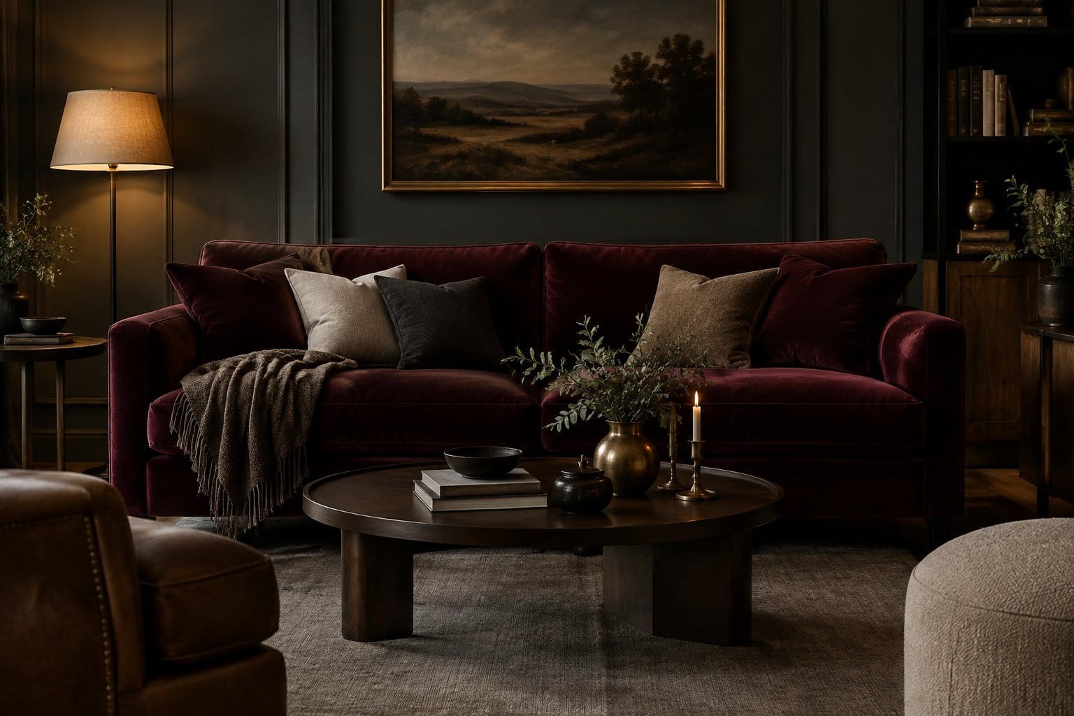
A burgundy velvet sofa adds moody color without a single brushstroke. Velvet catches light in its pile, so the color shifts from wine red to almost black as you walk around it.
It works in more rooms than you’d guess:
- Against charcoal or deep green walls, it reads rich and old-world.
- Against warm white walls, it becomes the one bold piece that anchors the room.
- With brass lamps and a jute rug, it feels relaxed instead of formal.
If burgundy feels like a big leap, a darker option like this black velvet Chesterfield sofa with rolled arms gives you a similar tufted, vintage feel.
Now the real talk. Velvet shows pet hair, and it crushes where you sit most. A lint roller becomes your friend. Performance velvet with a tight weave holds up better to kids and claws, and it cleans more easily than cotton velvet.
4) Pair Walnut Furniture With Cream Bouclé Chairs
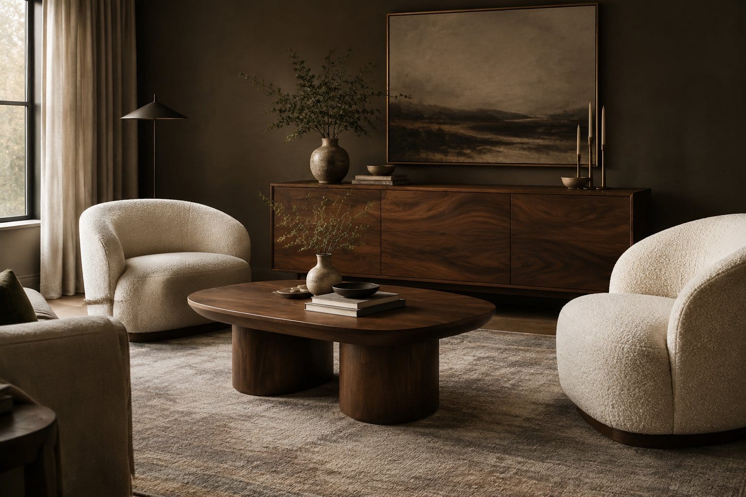
Walnut and cream bouclé give you moody warmth through contrast. The dark wood brings depth, and the nubby, pale fabric keeps the room soft and bright.
This combo is perfect if your walls must stay light. The mood comes from the furniture, not the paint.
How to style it:
- Choose walnut with visible grain. A low coffee table, like this round dark walnut lift-top table, adds storage too.
- Set two cream bouclé chairs facing the sofa for a cozy conversation spot.
- Add one dark element on the wall, like a moody print or a black lamp, to tie it together.
The catch is that cream bouclé picks up dirt, and its loops snag on pet claws. Look for chairs with removable covers, or pick an oatmeal shade that hides wear better than bright white.
5) Layer Table Lamps With Warm White Bulbs
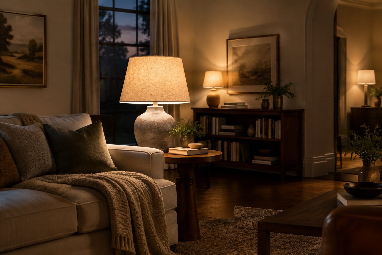
Lighting does more for a moody room than any paint color. Several low lamps create pools of glow, and dark corners turn cozy instead of gloomy.
Start with the bulb. Warm light around 2,700 K is described as friendly and personal by the U.S. Department of Energy and suits homes, while 4,100 K reads clean and efficient, like an office. Stick with 2,700 K for evenings. The same agency notes ENERGY STAR bulbs must have a CRI of 80 or higher, which keeps your dark greens and reds from looking muddy.
Build your layers:
- Put a lamp in at least three corners or zones.
- Keep shades in linen, pleated fabric, or amber glass.
- Add black iron wall candle sconces for flicker at eye level.
The Department of Energy also suggests pairing task lamps with lower overhead light levels, which happens to be exactly the moody look. Put the ceiling light on a dimmer and use it rarely.
6) Hang Dark Floral Wallpaper in a Powder Room
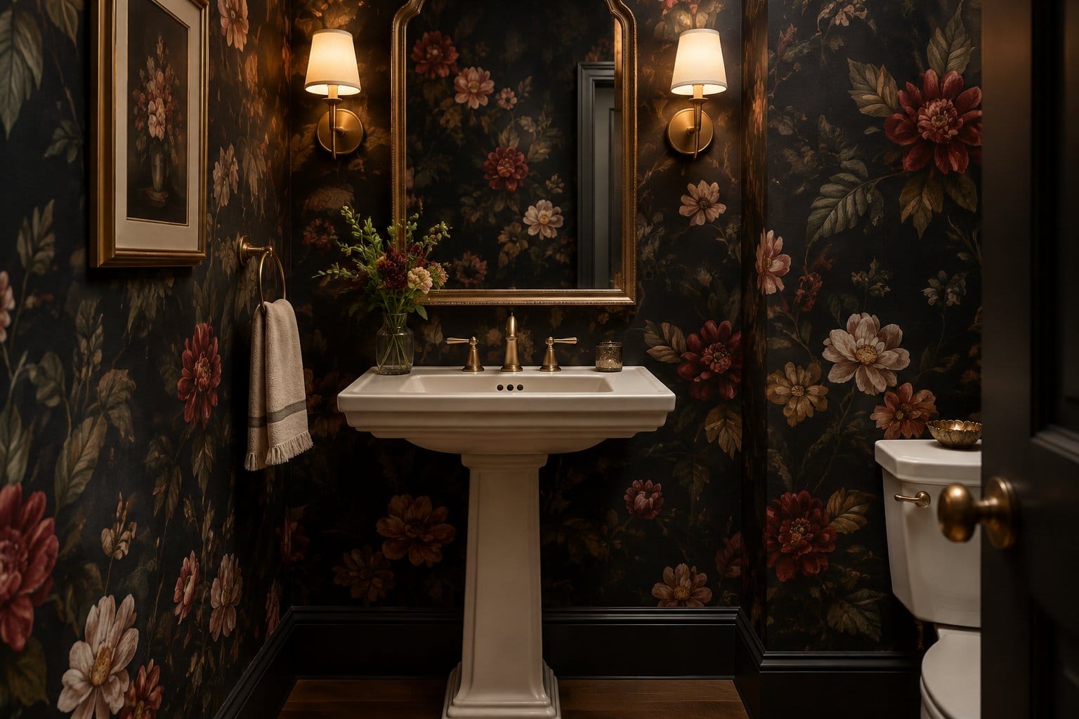
A powder room is the best place to go bold because guests pop in, get delighted, and leave. Dark floral wallpaper turns a tiny, boring room into a jewel box.
Pick a pattern with big blooms on a black, navy, or deep green background. Large prints look better in small rooms than tiny busy ones, which can feel jittery.
Before you hang anything, check your paint. One peel-and-stick maker recommends waiting at least 30 days after painting before installing, and warns that flat or matte paint can peel off when you remove the paper. Eggshell, satin, or semi-gloss walls work best.
Want a damask look instead of florals? This black vintage damask peel-and-stick wallpaper gives a similar dramatic effect.
Finish with a brass or black mirror and a warm sconce. Powder rooms lack showers, so humidity stays low and the paper lasts.
7) Paint Built-In Bookshelves Deep Navy
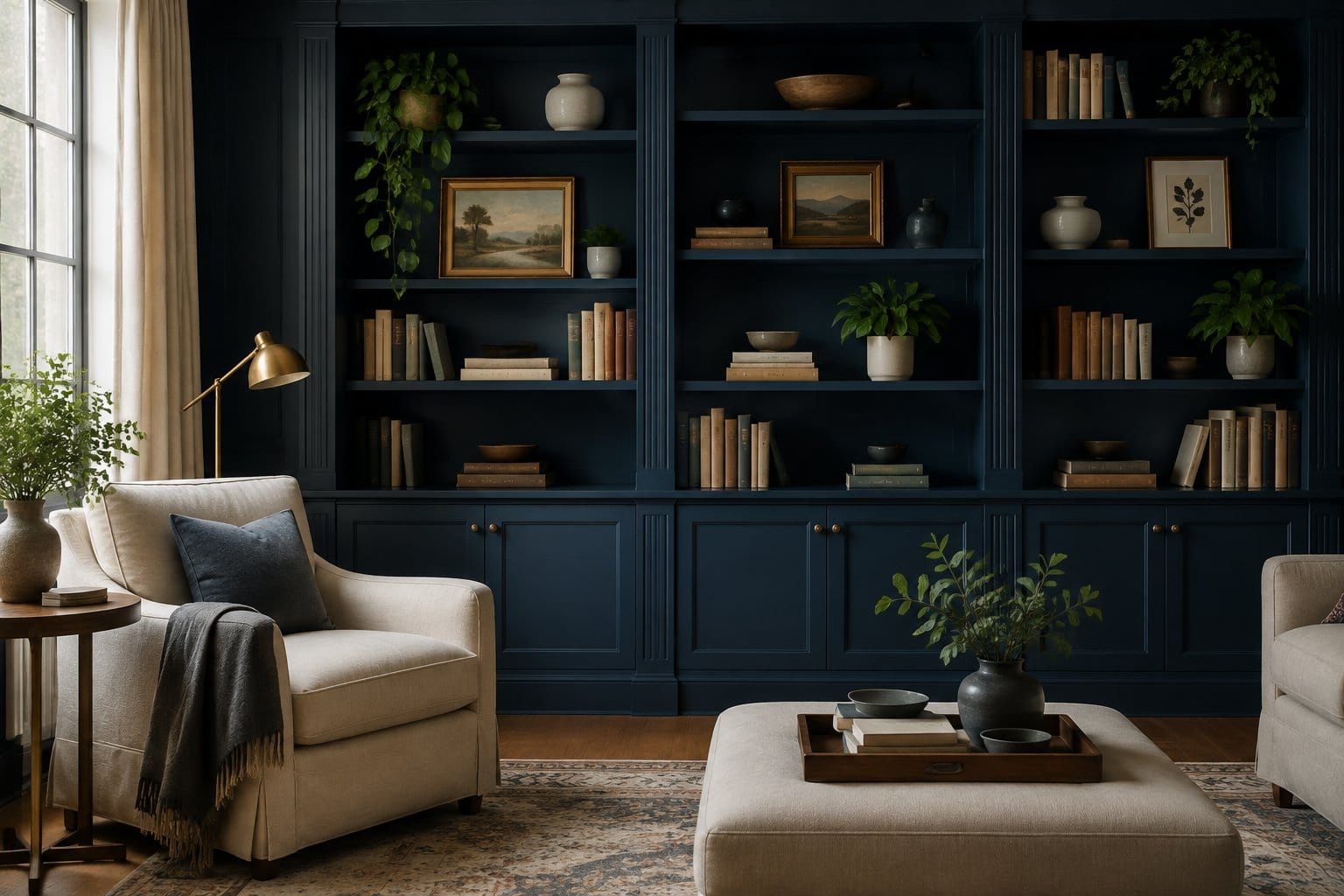
Deep navy bookshelves make everything on them look curated, even your mismatched paperbacks. The dark backdrop pushes the books and objects forward like a museum display.
This is a smart middle step between an accent and a full room. You get a big block of color, but the walls can stay light.
Make it look intentional:
- Paint the backs, sides, and shelves all navy for a clean, built-in look.
- Use a satin or semi-gloss finish. Shelves take a beating from books sliding around.
- Mix books with brass objects, pottery, and heavy fleur-de-lis bookends to hold rows upright.
- Leave some empty space on each shelf so it breathes.
Add a small picture light or LED strip under each shelf. Navy swallows light, and without it the back of the unit disappears at night. Painting shelves is fussy work, so budget a few evenings and sand between coats.
8) Hang an Antique Brass Mirror Against a Dark Wall
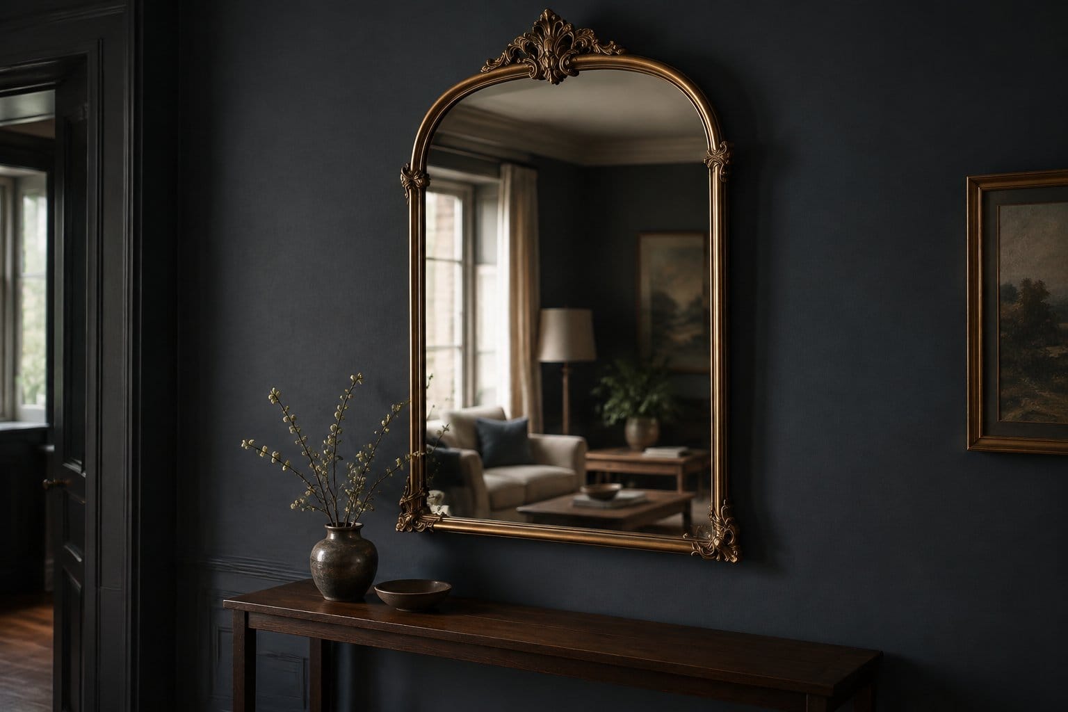
An antique brass mirror is the jewelry of a dark room. The metal glows against charcoal or green paint, and the glass bounces lamplight back into the space.
Hang it above a console or mantel with the center about 57 to 60 inches from the floor, which is standard gallery height. Place a lamp or candles in front so the reflection doubles the glow.
What to look for:
- Ornate frames feel old-world and romantic.
- Slim, aged brass suits modern or mid-century rooms.
- Built-in candle arms, like this vintage gold baroque mirror with candle holders, add extra drama.
Thrift stores and estate sales are gold mines for real brass. Heavy mirrors need proper anchors or a French cleat, especially on plaster walls. Skip the single nail. You’ll thank yourself later.
9) Place a Shadowy Oil Painting Above the Mantel
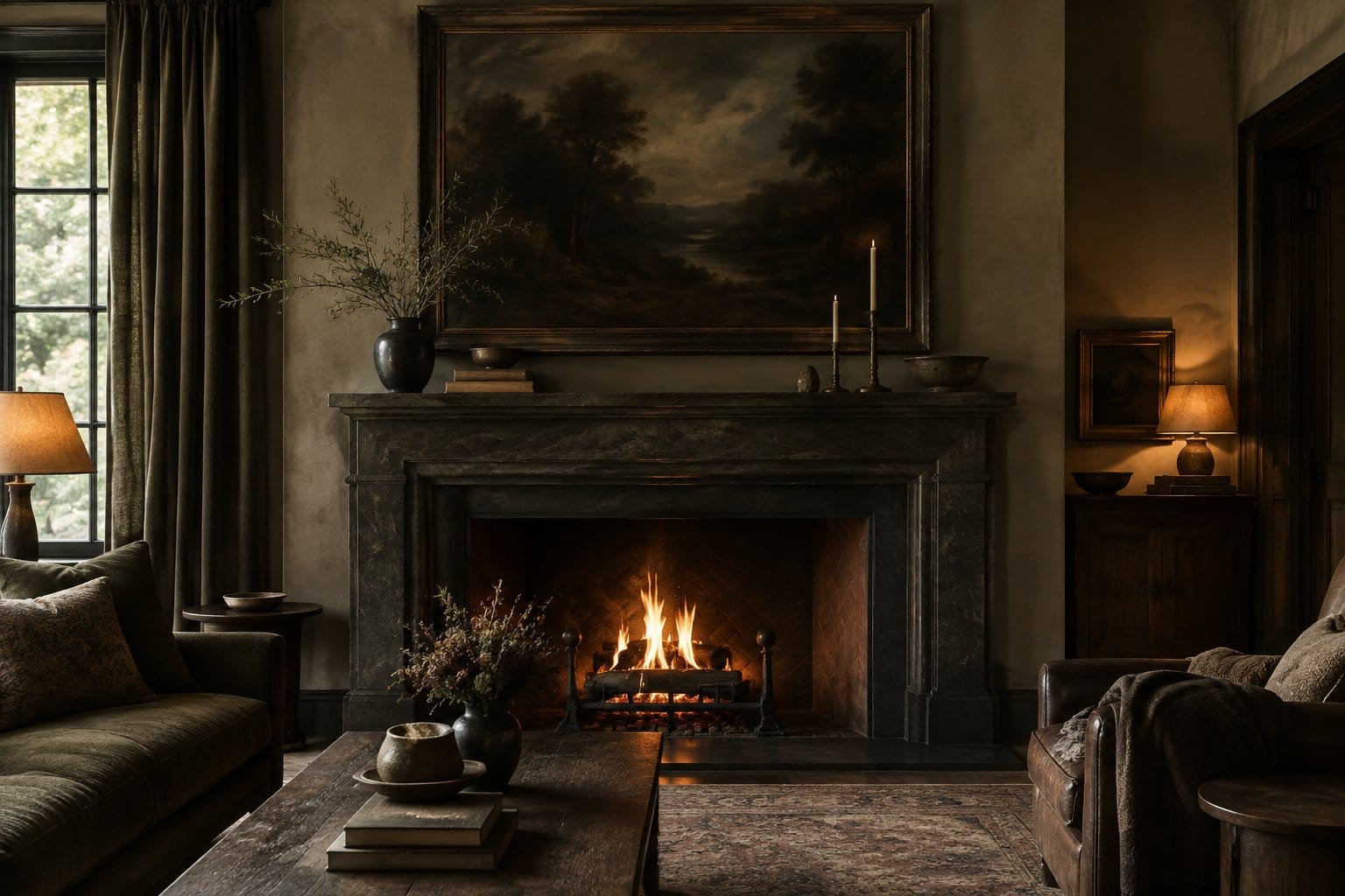
A dark oil painting above the mantel gives your room a story. Think moody landscapes, still lifes with deep shadows, or old portraits with that serious look.
You don’t need a real old master. Flea markets, antique malls, and online auction sites sell vintage oils for less than framed prints at big stores. Printed reproductions on canvas work fine too.
Size matters here in a practical way. The painting should be about two-thirds the width of the mantel. Too small and it looks lost.
Styling tips:
- Hang the bottom edge 6 to 10 inches above the mantel.
- Choose a heavy gilt or dark wood frame.
- Add a picture light above it on a warm bulb.
Keep the mantel below simple: two candlesticks, a stack of books, or a single vase. The painting is the star.
If you’re hanging a real oil painting, keep it away from a fireplace that gets heavy use. Heat and soot can damage old canvas over time.
10) Soften Dark Walls With Floor-Length Oatmeal Curtains
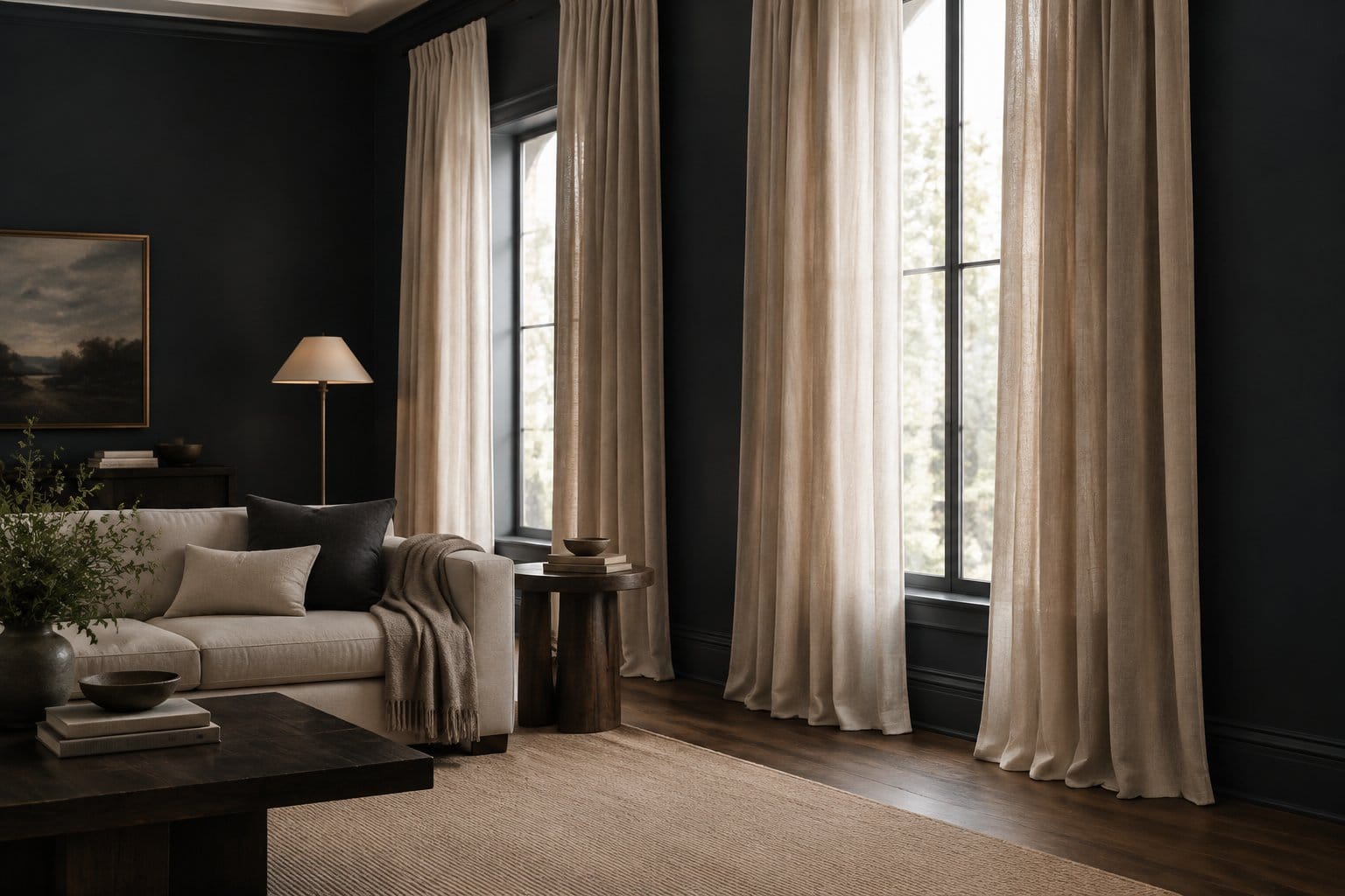
Oatmeal curtains are the fix for a dark room that feels a little heavy. The pale, warm fabric frames the windows and gives your eyes a soft place to rest.
Go floor-length, always. Curtains that stop at the sill look short and chop the wall in half. Hang the rod 4 to 6 inches above the window frame and let the panels just kiss the floor.
Material choices:
- Linen or linen-blend for a relaxed, slightly wrinkled look.
- Heavier cotton if you want more privacy.
- Blackout lining for bedrooms.
Extend the rod 8 to 12 inches past each side of the window. When the curtains are open, you get all your daylight back, which a dark room needs.
Want to lean moody instead of soft? Deep burgundy blackout curtains against dark walls create a cocoon effect.
11) Ground the Room With a Faded Rust-and-Navy Rug
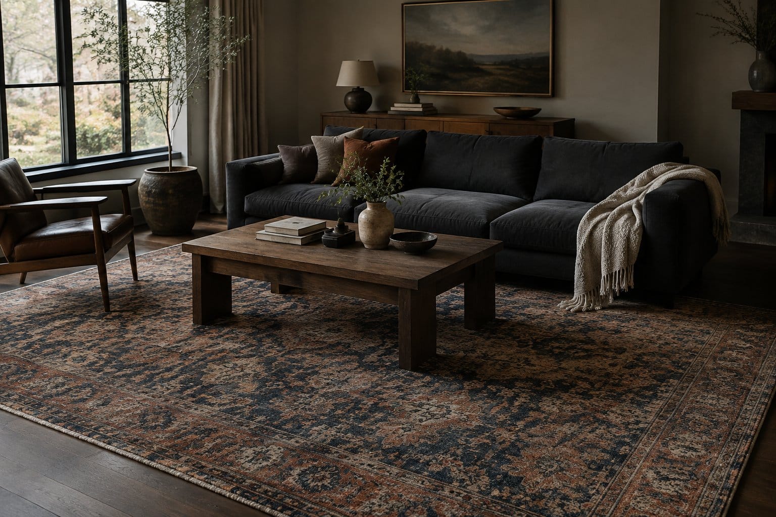
A faded rust-and-navy rug connects warm and cool colors in one piece. It gives dark rooms a lived-in feel, like it’s been in the family for decades.
The faded part is key. Worn, vintage-style rugs have softer colors than brand-new ones, so they mix with everything instead of shouting. Rust brings warmth, and navy links to dark walls or shelves.
Getting the size right:
- In a living room, at least the front legs of the sofa and chairs should sit on the rug.
- An 8×10 fits most living rooms. A 5×8 almost always looks too small.
- Leave 12 to 18 inches of bare floor around the edges.
Real vintage wool rugs cost more, but they hide stains and last for years. Low-pile, machine-washable versions are great if you have pets or kids.
Add a rug pad. It stops sliding, protects hardwood, and makes a thin rug feel plush underfoot.
12) Pair Chocolate Brown Bedroom Walls With Ivory Bedding
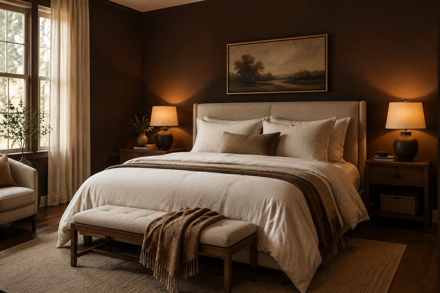
Chocolate brown walls make a bedroom feel like a warm hug. Brown is gentler than black, and it looks rich instead of cold at night.
Ivory bedding is the perfect partner. It keeps the bed bright and inviting, and it looks softer than stark white against brown.
Build the room in layers:
- Stack ivory sheets, a linen duvet, and a chunky knit throw.
- Add pillows in camel, rust, or mushroom.
- Put a matching lamp on each nightstand with a warm bulb.
- Use a wood or upholstered headboard for extra texture.
Bedrooms are the easiest place to try a dark wall color. You mostly use them at night, so low daylight isn’t a problem.
The tradeoff is mornings. A north-facing brown bedroom feels dim on winter mornings. Choose a brown with red or warm undertones, and keep a brighter overhead light on a dimmer for getting dressed.
13) Set a Cognac Leather Armchair in a Reading Nook
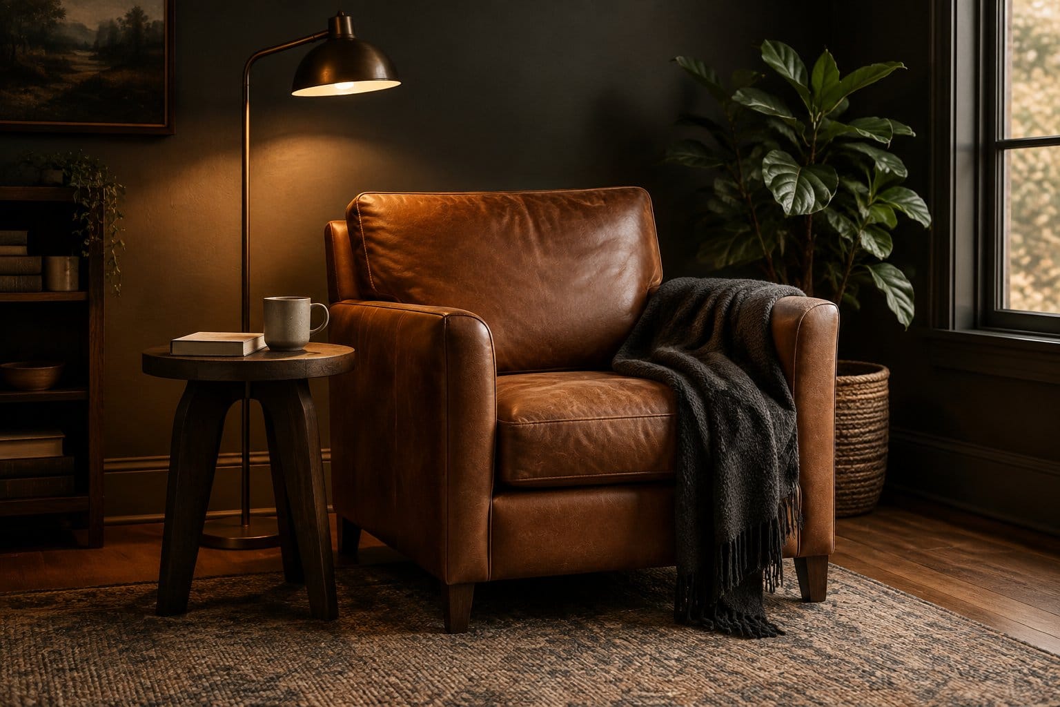
A cognac leather armchair turns an empty corner into the best seat in the house. The warm, orange-brown leather glows under lamplight and gets better with age.
Leather ages well, which is great news. Scratches and creases turn into patina, so you won’t stress about wear the way you would with velvet.
What a reading nook needs:
- A comfy chair with good back support.
- A floor lamp placed behind your shoulder, not beside your eyes.
- A small side table for tea or a book.
- A throw blanket and maybe an ottoman.
Pick a corner near a window for daytime reading. Dark walls behind the chair make the cognac pop.
Real leather costs more up front, but top-grain lasts decades. Bonded leather looks similar in photos but peels within a few years. Check the tag before you buy.
14) Hang a Smoked-Glass Pendant Over the Dining Table
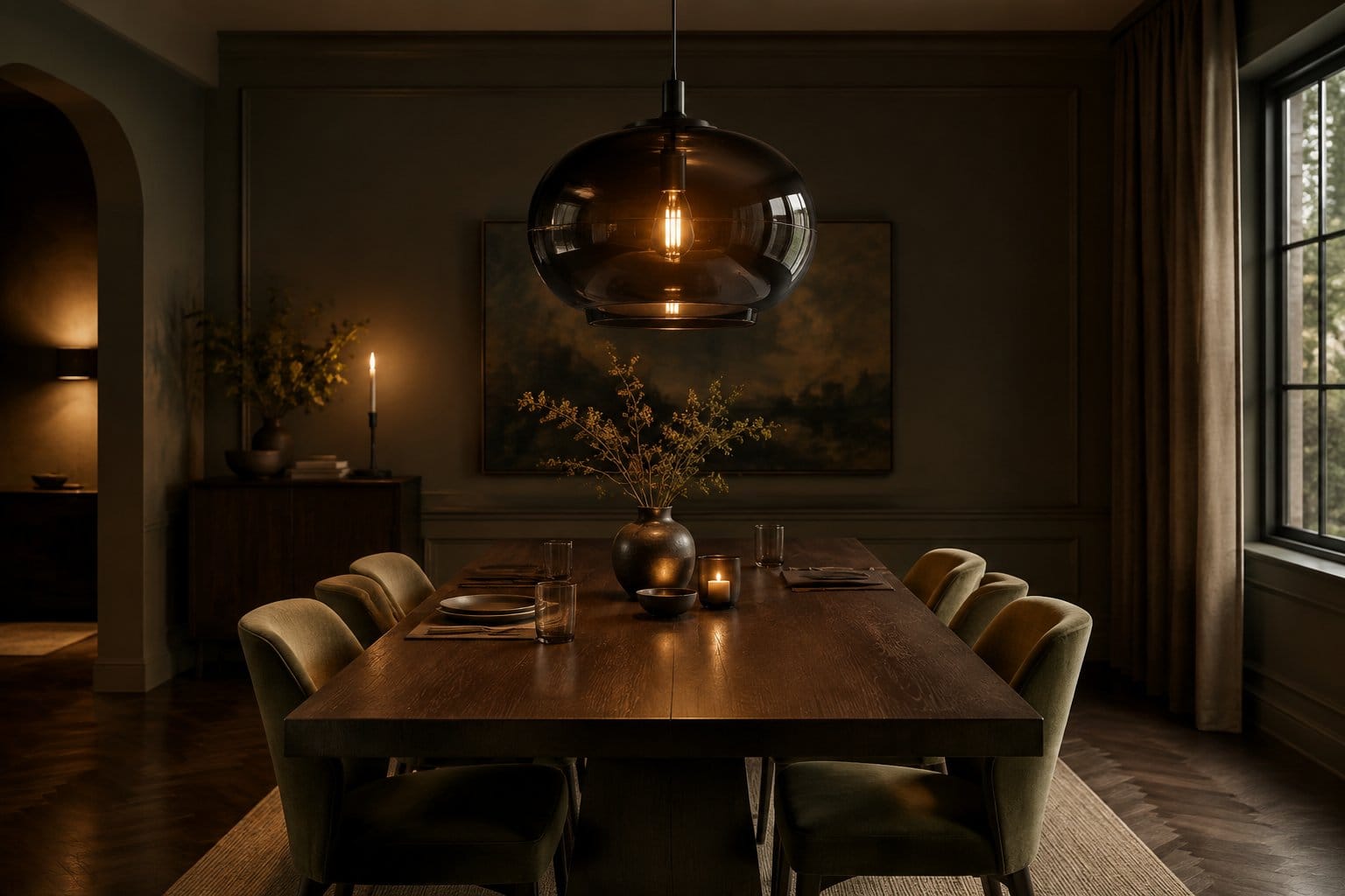
A smoked-glass pendant adds mood even with the light off. The gray-brown glass looks like a piece of art, and when it’s on, it gives a soft amber glow.
Hang it so the bottom sits about 30 to 36 inches above the tabletop. That’s low enough to feel intimate but high enough that guests can see each other.
Sizing guide:
- The pendant should be about half to two-thirds the width of your table.
- For long tables, hang two or three smaller pendants in a row.
Smoked glass dims the light it gives off, so use a brighter bulb than you think, or put it on a dimmer. A dimmer lets you go bright for homework and low for dinner parties.
Prefer something more dramatic? A crystal candle-style chandelier gives a vintage, glam version of the same mood.
Swapping a light fixture is a moderate DIY job. If your wiring looks old, call an electrician.
15) Add a Black Marble Coffee Table With Visible Veining
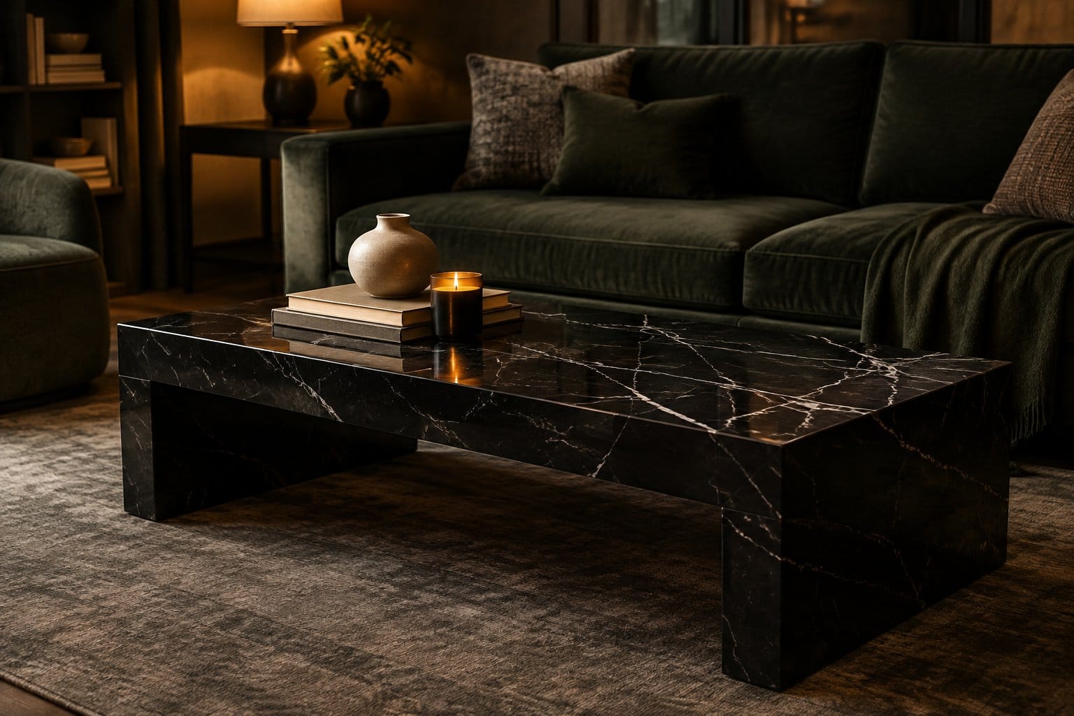
A black marble coffee table brings instant drama to the center of the room. The white veining adds movement, so the stone looks alive instead of like a flat black slab.
It works in both moody modern rooms and old-world spaces. Pair it with velvet and brass for glam, or with linen and wood for a softer look.
Styling tips:
- Keep the top simple: a tray, a candle, and a few books.
- Choose a round or oval shape in tight rooms to avoid bumped shins.
- Balance the heavy stone with lighter chairs or an open-leg sofa.
Now, honest tradeoffs. Real marble is porous. Red wine, coffee, and lemon juice can etch or stain it. Use coasters and seal it once or twice a year.
Marble is also heavy. Some tables weigh over 100 pounds, so plan where it goes before delivery day. Sintered stone and porcelain look similar and resist stains better.
16) Arrange Dark Botanical Prints in Mixed Wood Frames
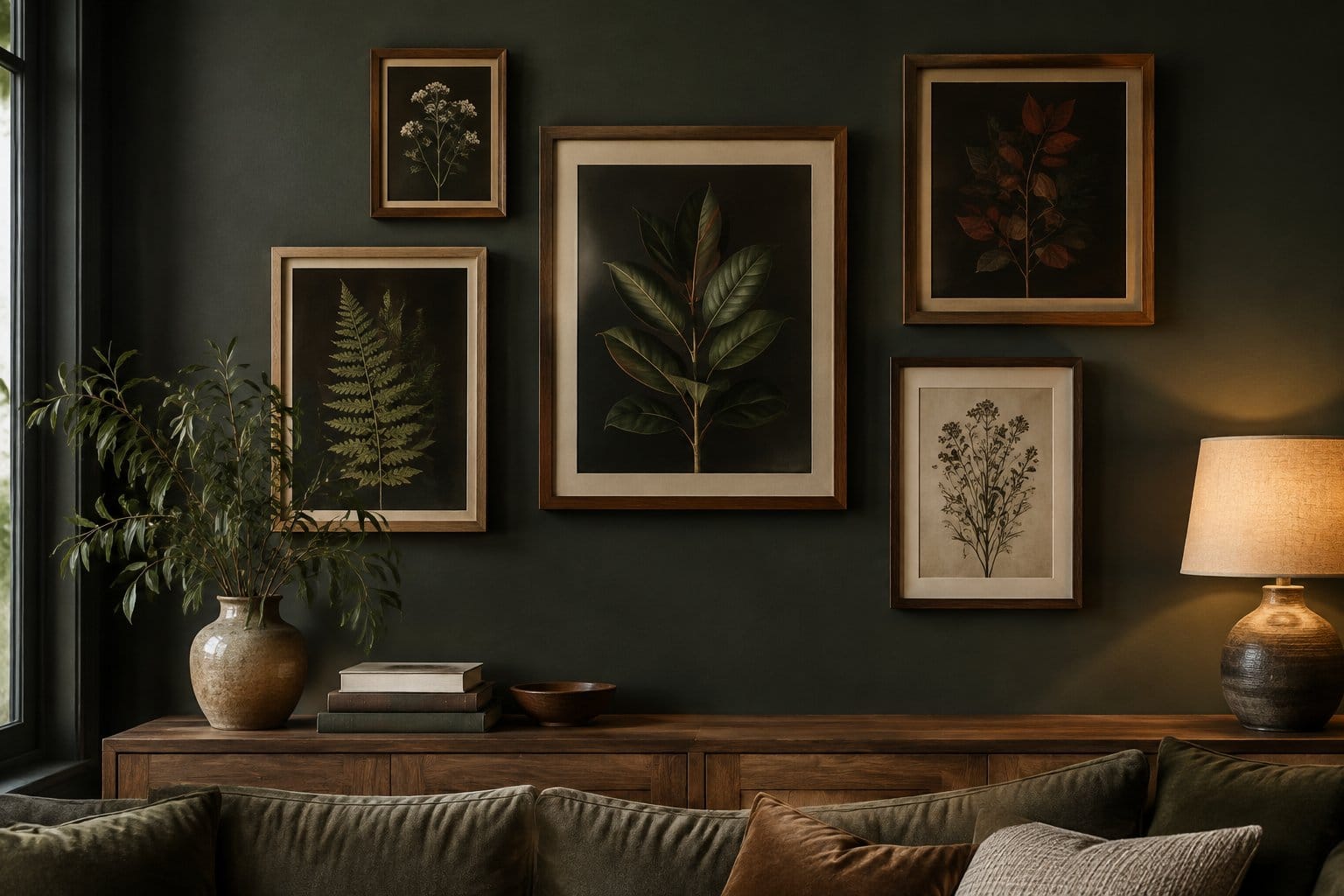
Dark botanical prints bring nature into a moody room without needing real plants to survive low light. Think ferns, mushrooms, and flowers on black or deep green backgrounds.
Mixed wood frames make the wall look collected over time. Blend walnut, oak, and a black frame or two. Matching frames look more formal and catalog-like.
How to hang a grouping:
- Lay the frames on the floor first and move them around.
- Keep 2 to 3 inches between frames.
- Center the whole group at eye level, about 57 inches from the floor.
- Trace frames on kraft paper and tape it to the wall before drilling.
Vintage book plates and museum print downloads are cheap ways to get real botanical art. Many museums share public domain images you can print at a local shop.
If you want a witchier twist, swap one botanical for celestial art, like these dark sun and moon tarot prints.
17) Paint a Dining Room Ceiling Deep Plum
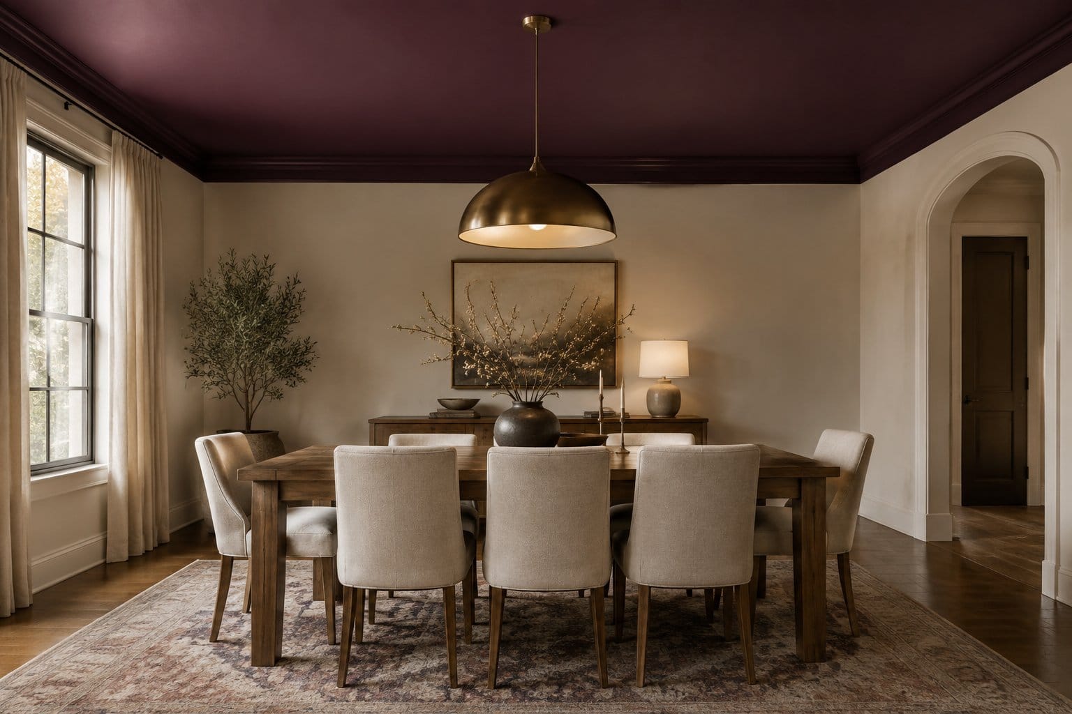
A deep plum ceiling is the surprise element nobody expects. It makes the dining room feel cozy and intimate, like eating in a candlelit restaurant.
People worry a dark ceiling makes a room feel shorter. In practice, it blurs the edges of the ceiling, so it often feels deeper, not lower. It works best in rooms with ceilings 8 feet or higher.
Tips:
- Keep walls lighter, like a warm cream or blush, or go plum on everything for a full drench.
- Use a flat or matte finish on the ceiling to hide bumps.
- Pick a plum with red undertones for warmth. Blue-leaning plums can look cold.
When you test swatches, look up at them. Benjamin Moore advises looking up at ceiling samples for the best color reading, the same way you hold chips against a wall.
Painting a ceiling is messy, neck-straining work. Use an extension pole, drop cloths, and a tinted primer.
18) Display Dried Branches in Dark Ceramic Vases
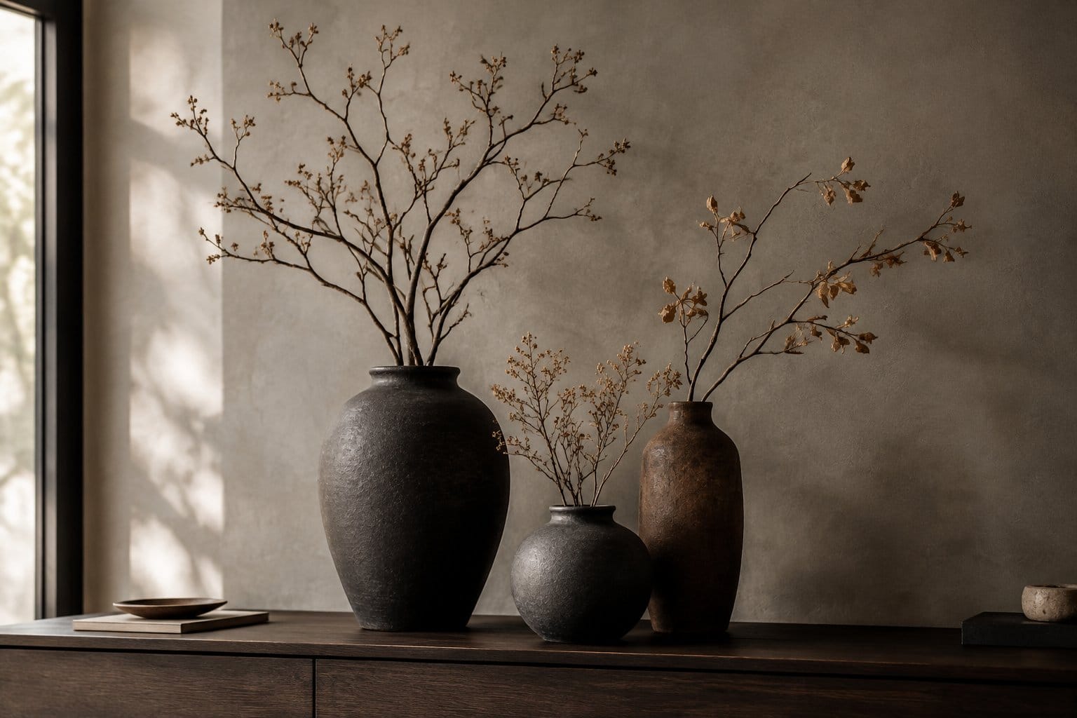
Dried branches in dark vases give you the look of plants in rooms where plants struggle. Moody rooms often have low light, and branches don’t care.
Good options include eucalyptus, dried oak leaves, pampas grass, bare willow, and cotton stems. You can also cut branches from your yard in fall and let them dry.
How to arrange them:
- Use tall vases for tall branches, about one and a half times the vase height.
- Group vases in odd numbers, like three or five, at different heights.
- Choose matte black, charcoal, or deep brown glazes.
- Place them on a console, mantel, or dining table.
Dried stems last months with almost no care. Just dust them once in a while with a hair dryer on cool.
Keep them away from candles, since dried plants catch fire fast. If you love the glow of candles nearby, use flameless ones. Pets sometimes chew dried stems, so check that your picks are safe for animals.
19) Finish Moss-Green Kitchen Cabinets With Brass Pulls
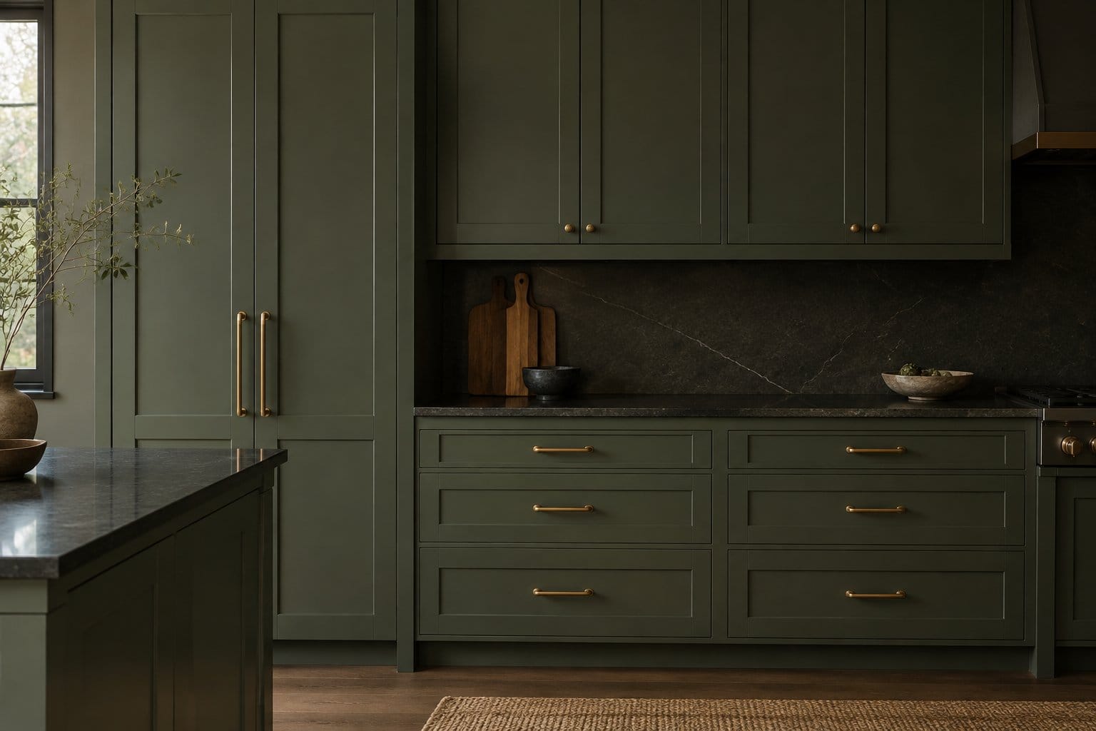
Moss-green cabinets with brass pulls make a kitchen feel earthy and warm. Green hides crumbs and fingerprints better than white, and brass adds a little shine.
This is a big commitment, so be honest with yourself about the work. Benjamin Moore’s nine-step cabinet painting guide includes removing doors and hardware, cleaning with degreaser, sanding with 100- to 150-grit paper, priming, sanding again with 220-grit, and two coats of paint. The brand recommends letting cabinets dry at least 24 hours before rehanging, and avoiding heavy scrubbing for five to seven days.
Plan for your kitchen to be out of commission for most of a week.
Style tips:
- Pair moss green with a dark soapstone or butcher block counter.
- Choose unlacquered brass if you like how it darkens with age.
- Keep the backsplash simple, like cream zellige tile.
Painting is cheaper than replacing cabinets, but a sloppy job shows every drip. Take your time on sanding.
20) Pair Deep Teal Bathroom Tile With Matte Black Fixtures
Deep teal tile with matte black fixtures makes a bathroom feel like a boutique hotel. The glossy teal reflects light, and the black faucets and shower head give crisp contrast.
Tile is the most permanent idea on this list, so pick a shade you’ll still love in ten years. Zellige, glazed subway, or hexagon tile all work well in teal.
Design tips:
- Use dark grout to hide stains and keep the look moody.
- Add a warm wood vanity or shelf to balance the cool teal.
- Hang a brass or black mirror and warm sconces on either side.
Waterproofing matters in a shower. Water-resistant board can handle some moisture, but only waterproof wallboard stands up to long-term water and steam, and installers recommend flood testing a shower pan for a minimum of four hours before tiling.
Matte black fixtures show water spots and soap film. Wipe them with a soft cloth after showers. Skip harsh scrubbers, which can scratch the finish.
How to Build a Moody Palette That Feels Livable
A livable moody palette starts with one warm-toned dark base, adds a lighter contrast color, and repeats a few materials like wood and brass across the room. Get those three choices right and almost any idea above will feel cozy.
How do you choose a dark base color for your room’s natural light?
Start by finding which way your biggest windows face. Light direction changes how a dark color looks more than anything else.
- North-facing rooms get cool, weak light. Sherwin-Williams advises that even bold, dark colors should have warm undertones in north-facing spaces. Chocolate brown, warm olive, and red-leaning plum shine here.
- South-facing rooms get warm light all day. Almost any dark color works, including cooler navy and teal.
- East and west rooms shift through the day. Choose the color based on when you use the room most.
Check a paint’s LRV, or light reflectance value, before buying. The scale runs from 0 to 100, with 0 reflecting no light. Most moody colors sit in the single digits or low teens.
How much contrast does a moody room need?
You need enough contrast that your eye has places to rest. A room with dark walls, dark floors, and a dark sofa feels heavy fast.
Aim for roughly this mix:
| Element | Role | Examples |
|---|---|---|
| Main dark color | About 60% of the room | Walls, ceiling, large cabinetry |
| Supporting shade | About 30% | Sofa, rug, curtains |
| Light or metallic accent | About 10% | Ivory bedding, brass mirror, cream chairs |
Texture counts as contrast too. Velvet, bouclé, leather, and linen all catch light differently, so a tone-on-tone room still has depth.
How do you carry one color story between rooms?
Pick one thread and repeat it in every room. That thread can be a metal, a wood tone, or an accent color.
For example, use forest green in the living room, then bring green into the kitchen as moss-green cabinets and into the bathroom as plants or towels. Repeat brass hardware throughout.
Hallways need extra care. When you can see two dark rooms at once, paint the hall a warm, lighter neutral so each room reads as its own space. Keep all trim the same color across the house for a calm, connected look.
Where to Start Based on Budget and Commitment
Start with lighting and textiles if you’re unsure, move to paint once you love the direction, and save cabinets and tile for when you’re certain. Low-risk changes teach you how dark tones look in your home before you spend big.
Which changes work if you rent or cannot paint?
Renters can get most of the moody look without a paintbrush:
- Swap every bulb to warm 2,700 K and add three or more lamps.
- Hang floor-length curtains in a deep color or warm oatmeal.
- Lay a vintage-style rug and add a velvet or leather accent chair.
- Hang a dark art grouping or a big thrifted oil painting.
- Use removable peel-and-stick wallpaper on one wall.
For wallpaper in bathrooms, keep it out of the shower. One maker notes its peel-and-stick products handle humidity but aren’t made for constant direct water contact.
Ask your landlord about paint too. Many allow it if you repaint the original color when you move out.
Where is it worth spending more?
Spend on the things you touch every day and the pieces that are hard to replace.
- Sofa and main chair. A well-built frame and durable fabric outlast trends.
- Rugs. Wool hides wear and stains better than cheap synthetics.
- Tile and cabinet work. Poor prep shows fast, and redoing it costs more than doing it right.
- Good paint. Dark colors need high-quality paint for even coverage.
Save on art, vases, pillows, and frames. Thrift stores, estate sales, and flea markets are where moody rooms get their character anyway.
What should you test before committing to a dark finish?
Always test dark paint in your actual room, at different times of day. Dark colors shift wildly between morning and night.
Benjamin Moore’s 8 oz. liquid samples cover about a 2-by-2-foot area in two coats, and the brand suggests brushing on at least two coats for accurate color. Its 10-by-12-inch foam sample board costs $5.99 and lets you move the color from wall to wall.
Test these things:
- How the color looks in morning daylight and under your evening lamps.
- How it sits next to your floor, sofa, and trim.
- How the sheen looks when light hits it from the side.
Live with samples for at least three or four days before buying gallons.
Frequently Asked Questions
How do you create a moody living room without making it feel gloomy?
Use warm undertones and plenty of warm lamps. A dark color with red, brown, or yellow undertones feels cozy, while cool grays can feel cold. Add soft textures and a few light accents, like ivory pillows or brass, to keep the room lively.
What colors work best for moody modern decor?
Charcoal, black, deep navy, forest green, and chocolate brown work well in modern rooms. Keep the lines clean and pair these colors with matte black, marble, or walnut. Limit your palette to two or three dark shades so the room stays sharp.
Can moody decor work in a small room?
Yes, small rooms are often the best place for dark colors. Powder rooms, dens, and small bedrooms feel cozy and jewel-like when painted dark. Color-drenching walls and ceiling blurs the corners, which helps the room feel less boxy.
How do you give a den a moody look on a budget?
Start with one gallon of dark paint on one wall, warm bulbs, and thrifted art. Add a secondhand leather chair and a throw blanket. Many pieces in our Gothic decor ideas you can use all year work well in a den too.
What is the difference between moody organic and moody industrial decor?
Moody organic uses earthy colors like olive, brown, and rust with natural materials such as linen, wood, and dried branches. Moody industrial leans on charcoal and black with metal, concrete, exposed brick, and leather. Both use dark colors, but organic feels softer and industrial feels rougher.